


Kayla Harrah Design x Annabode
Color trends are one of the most exciting ways to refresh and reimagine your home each year. But if committing to a full room makeover isn’t in the cards right now, then I’ve got you covered. You can still embrace the year’s top hues in creative and approachable ways without stressing over changing your entire home to stay on trend.
In this post, I’m exploring the 2025 color of the year from three of the most trusted names in color – Pantone, Benjamin Moore, and Sherwin Williams. We’ll also take a look at how to incorporate these stunning shades into your home without the pressure of permanence.
From throw pillows to kitchen essentials, I’ve rounded up my favorite home decor finds inspired by this year’s color palettes. Whether you’re drawn to moody tones, nostalgic hues, or bold statements – there’s something here for everyone to stay effortlessly on-trend.
2025 Color Of The Year: Pantone
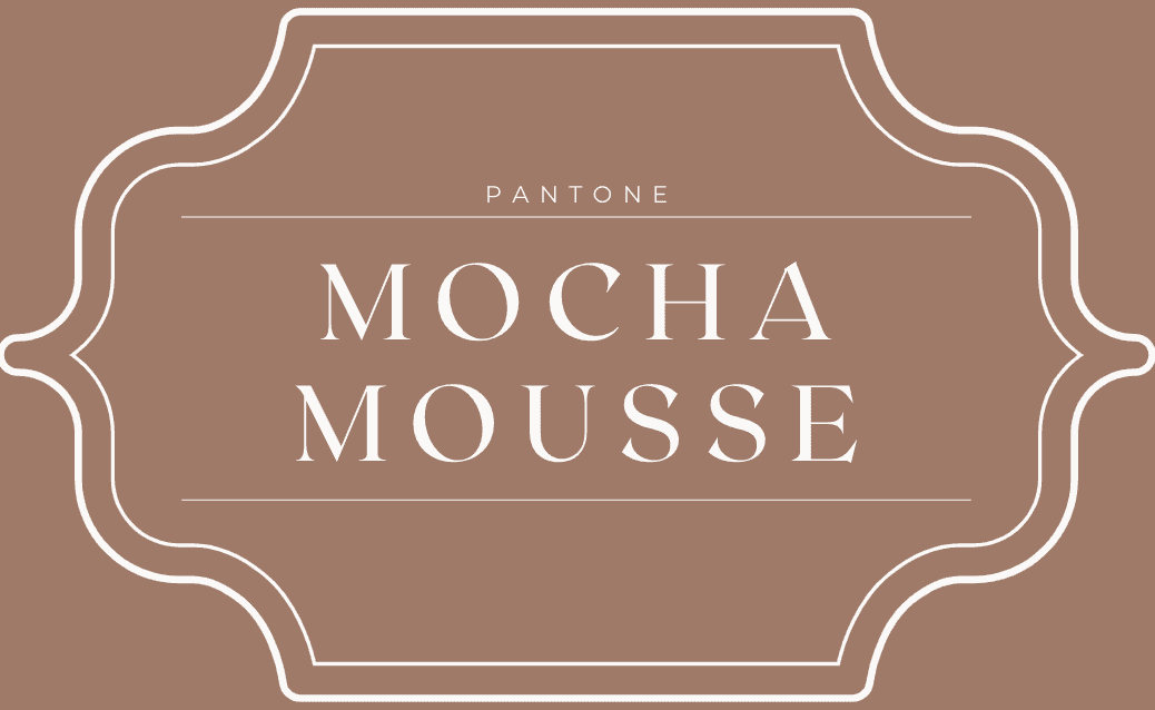
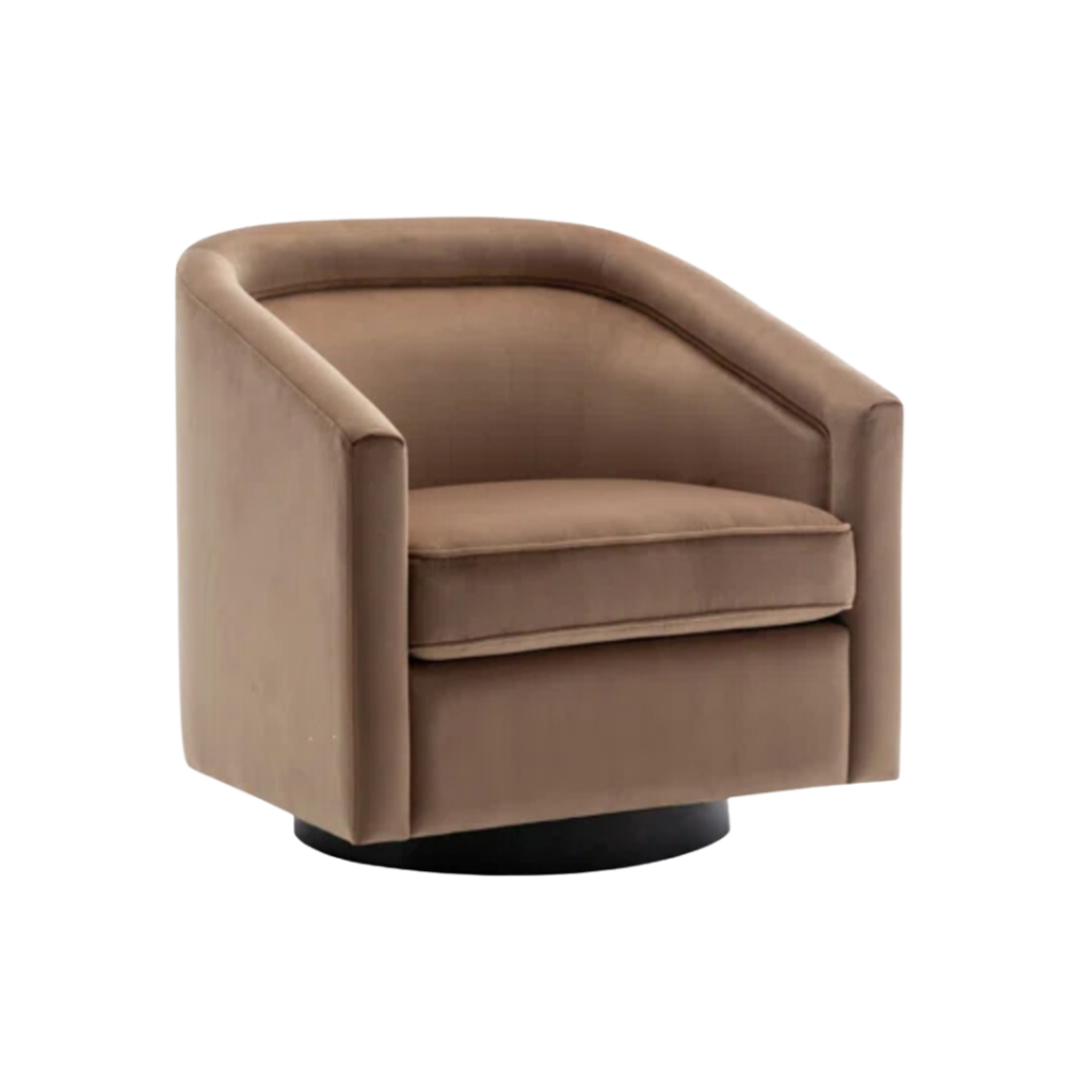
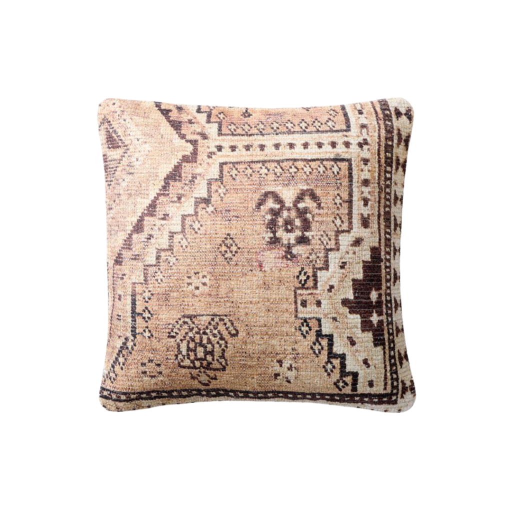
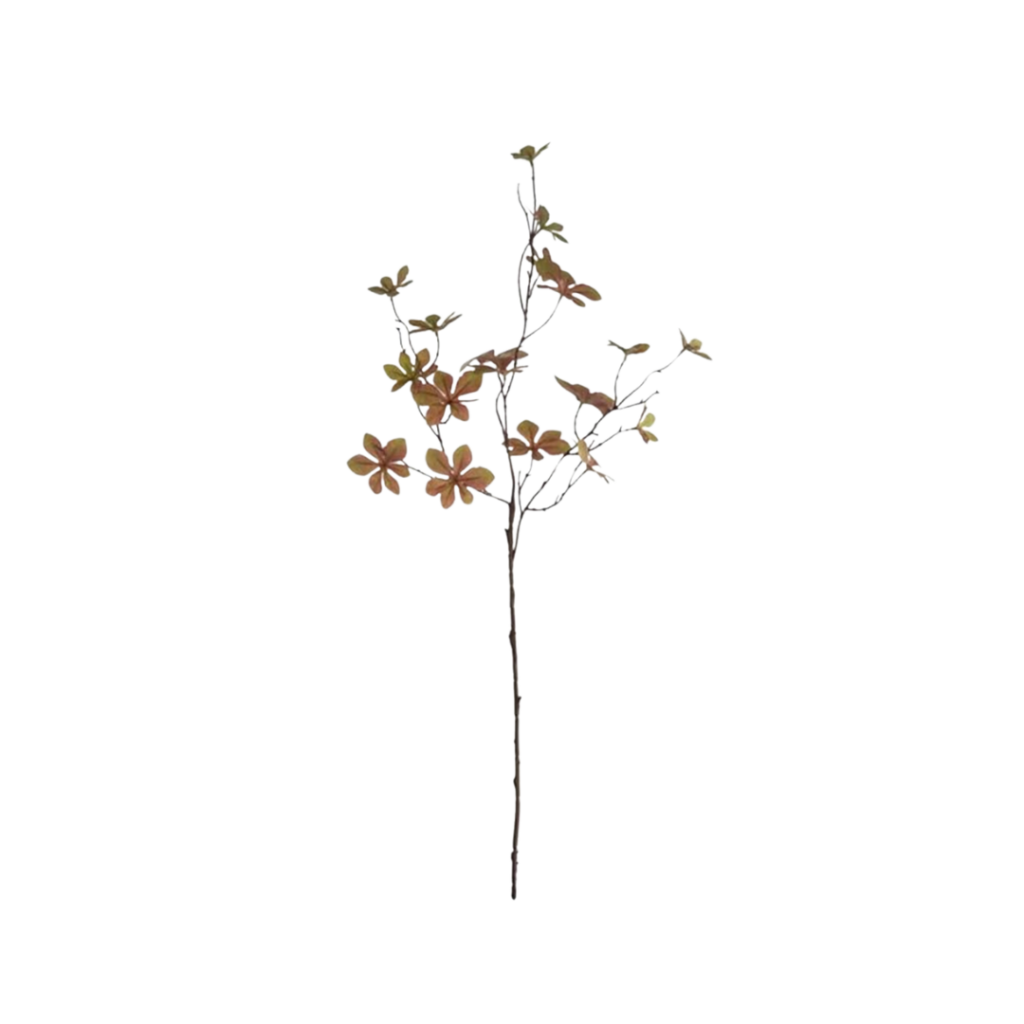
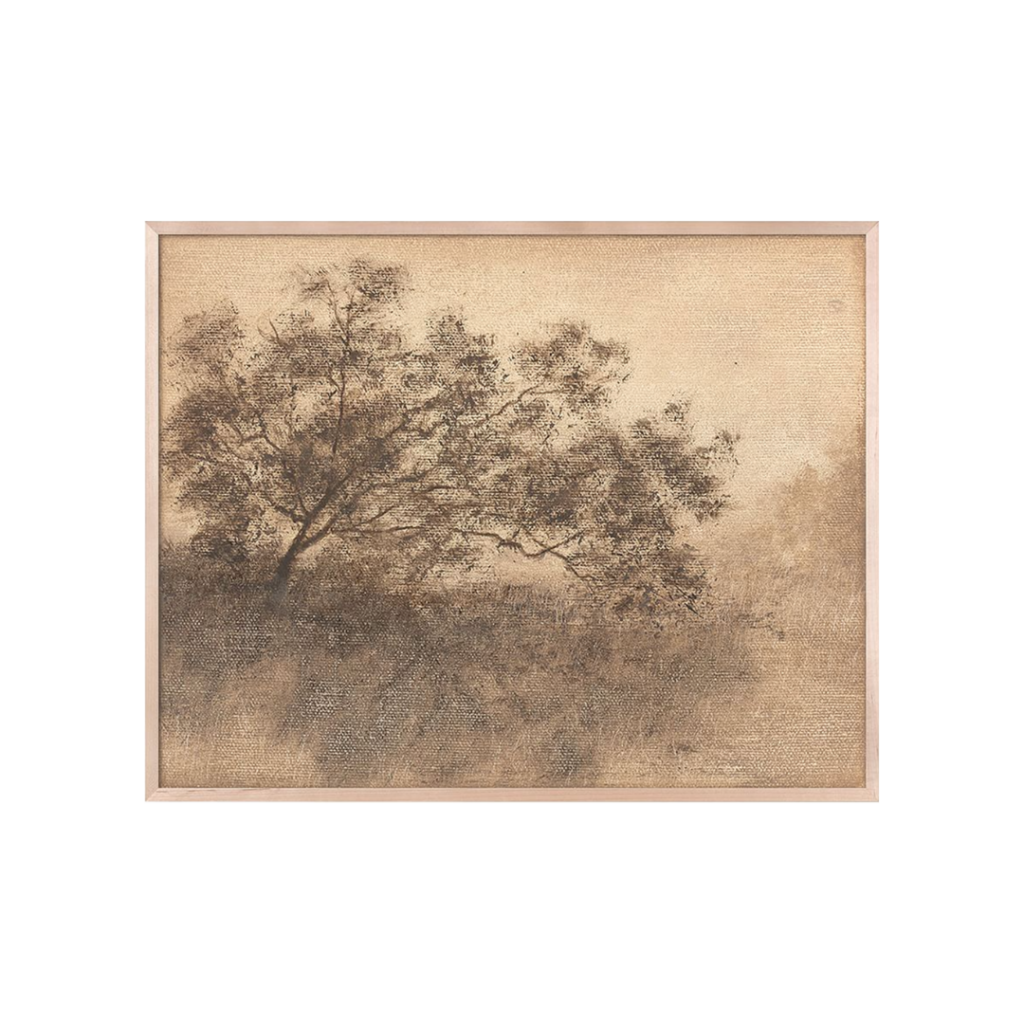
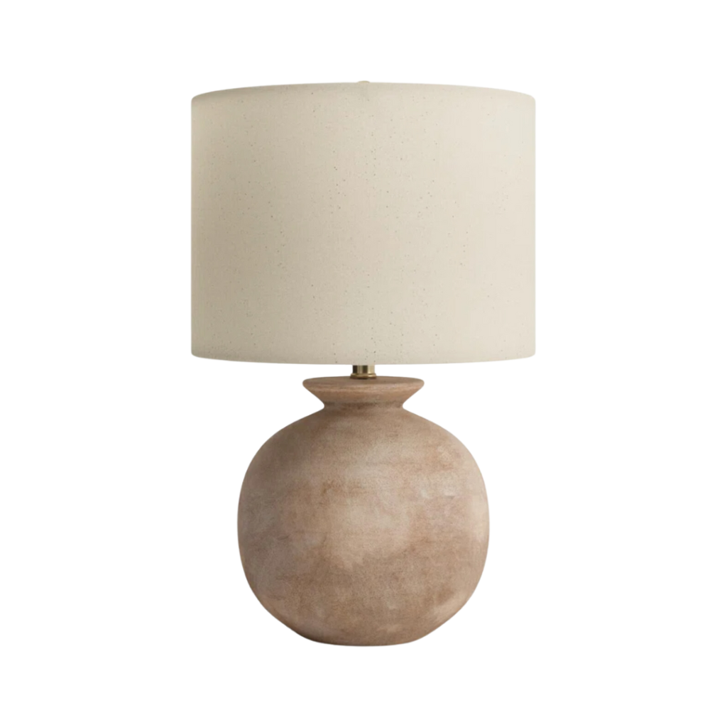
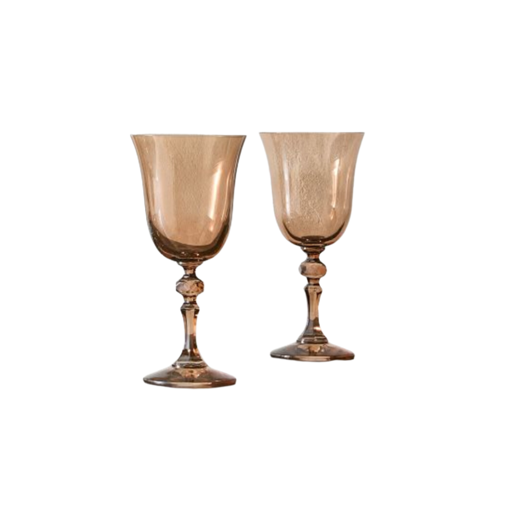
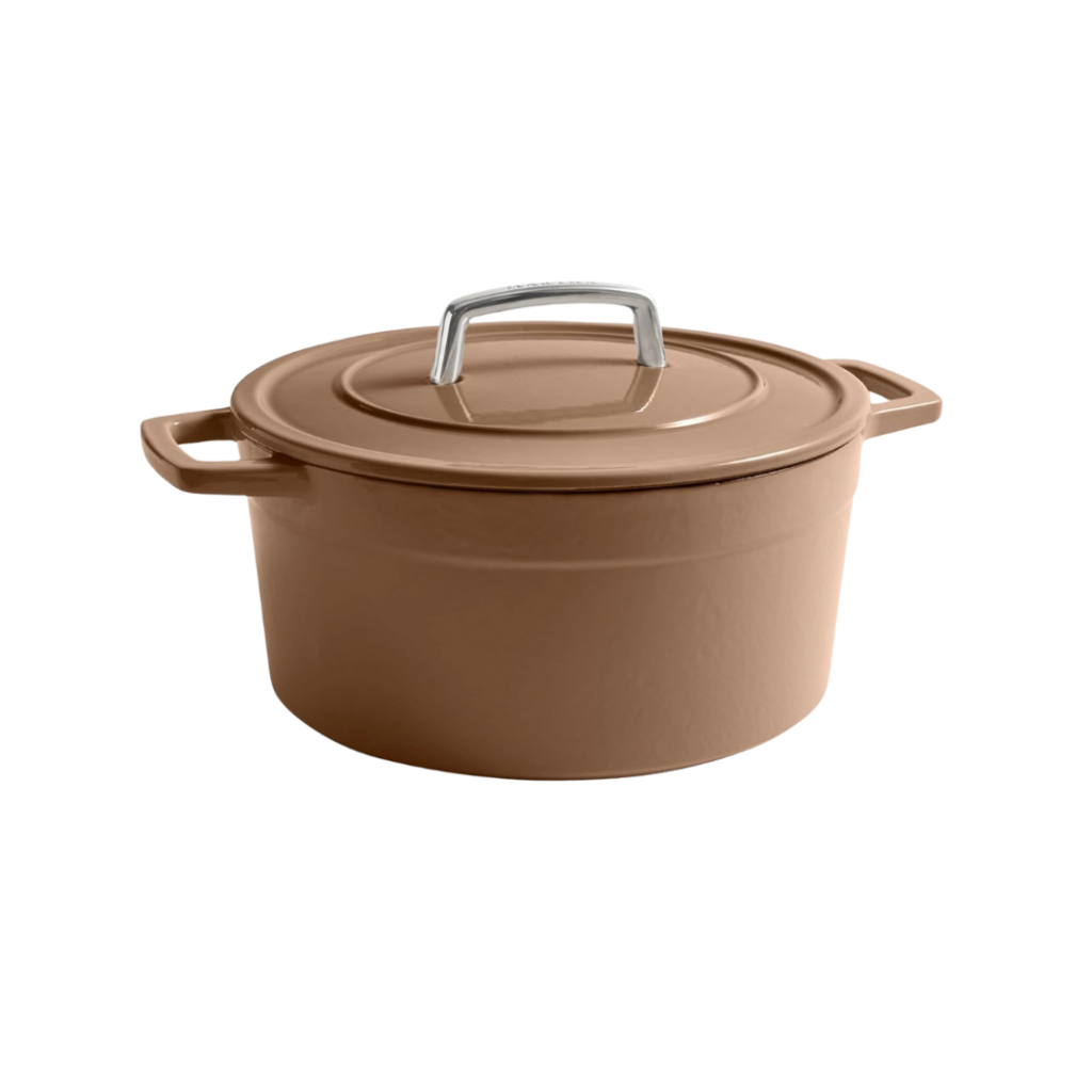
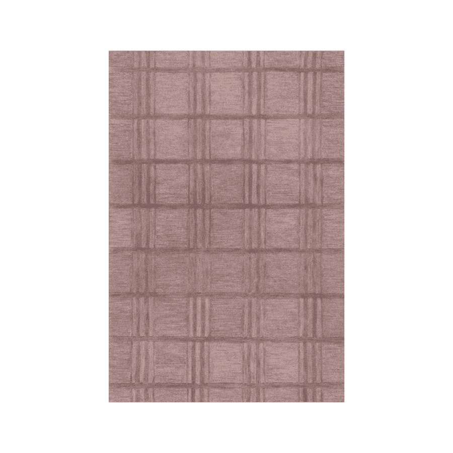
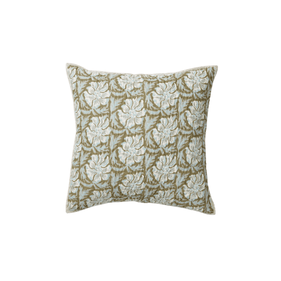
Pantone’s Mocha Mousse is the design equivalent of comfort food. It’s a beautifully soft brown hue with warm, terracotta undertones that radiates a subtle inner glow. This earthy-yet-energetic shade strikes the perfect balance between grounded sophistication and vibrancy which makes it an ideal choice for layering in interiors.
Mocha Mousse’s terracotta notes give it a natural, sunbaked quality, while the soft brown base keeps it versatile and timeless. No matter what type of space you are designing, this hue is sure to layer in the warmth.
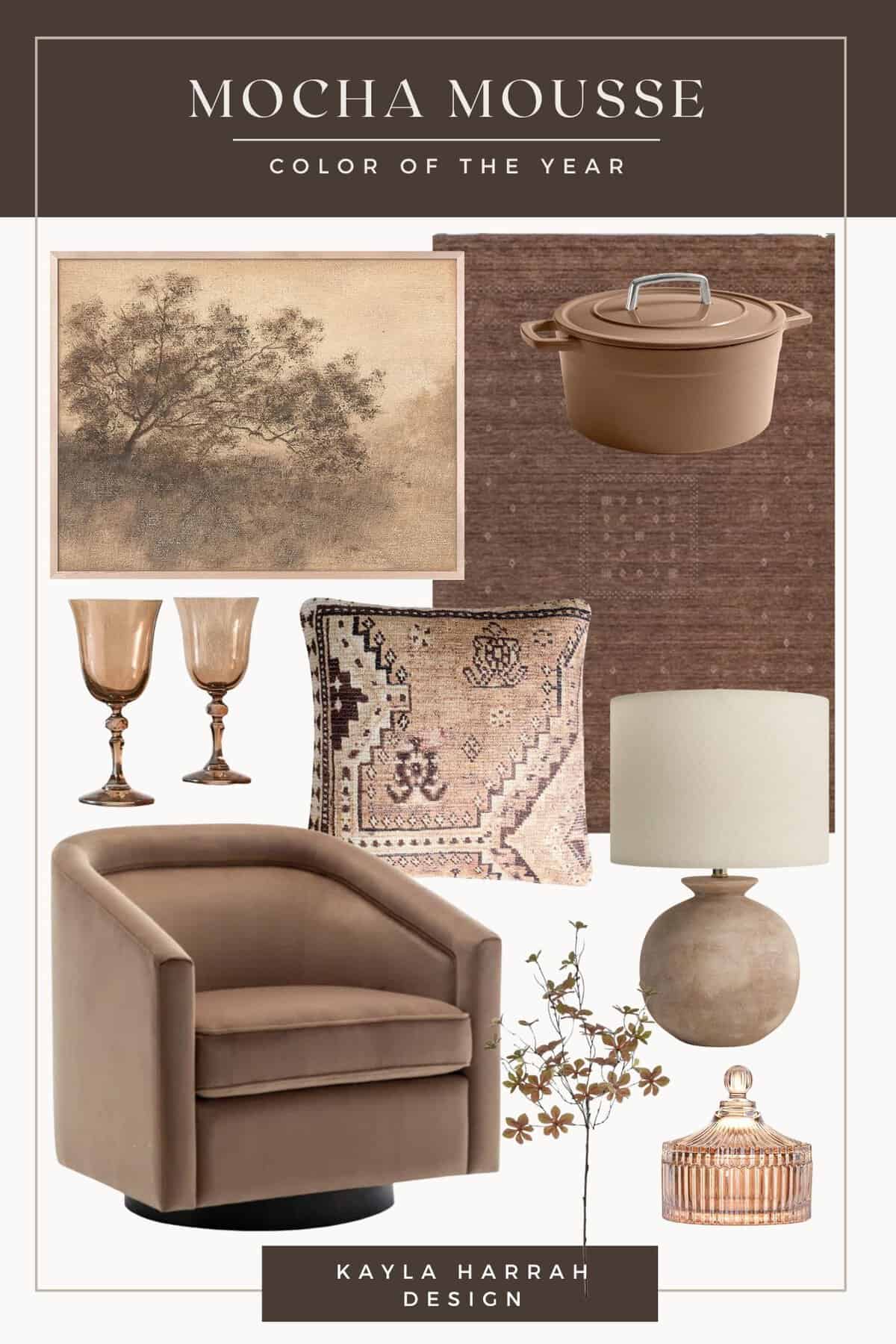
I love how effortlessly this color blends into various palettes, but pairing it with dessert-inspired hues really makes it sing. It also works beautifully alongside neutrals like cream and amber. Or, you can even consider going a bit more bold by pairing it with bright corals and chartreuse.
Personally, I think this hue will really shine in the kitchen where it’s rich warmth will foster a sense of connection and coziness. To incorporate Mocha Mousse into your own home, try using it as a base layer in a woven area rug or as an upholstered accent piece.
Whether the star of the room or a supporting player, Mocha Mousse is ready to bring versatility to your home.
2025 Color Of The Year: Benjamin Moore
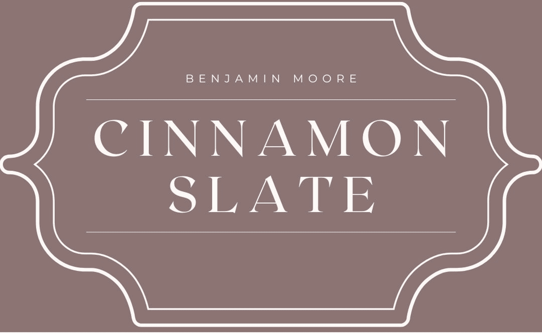
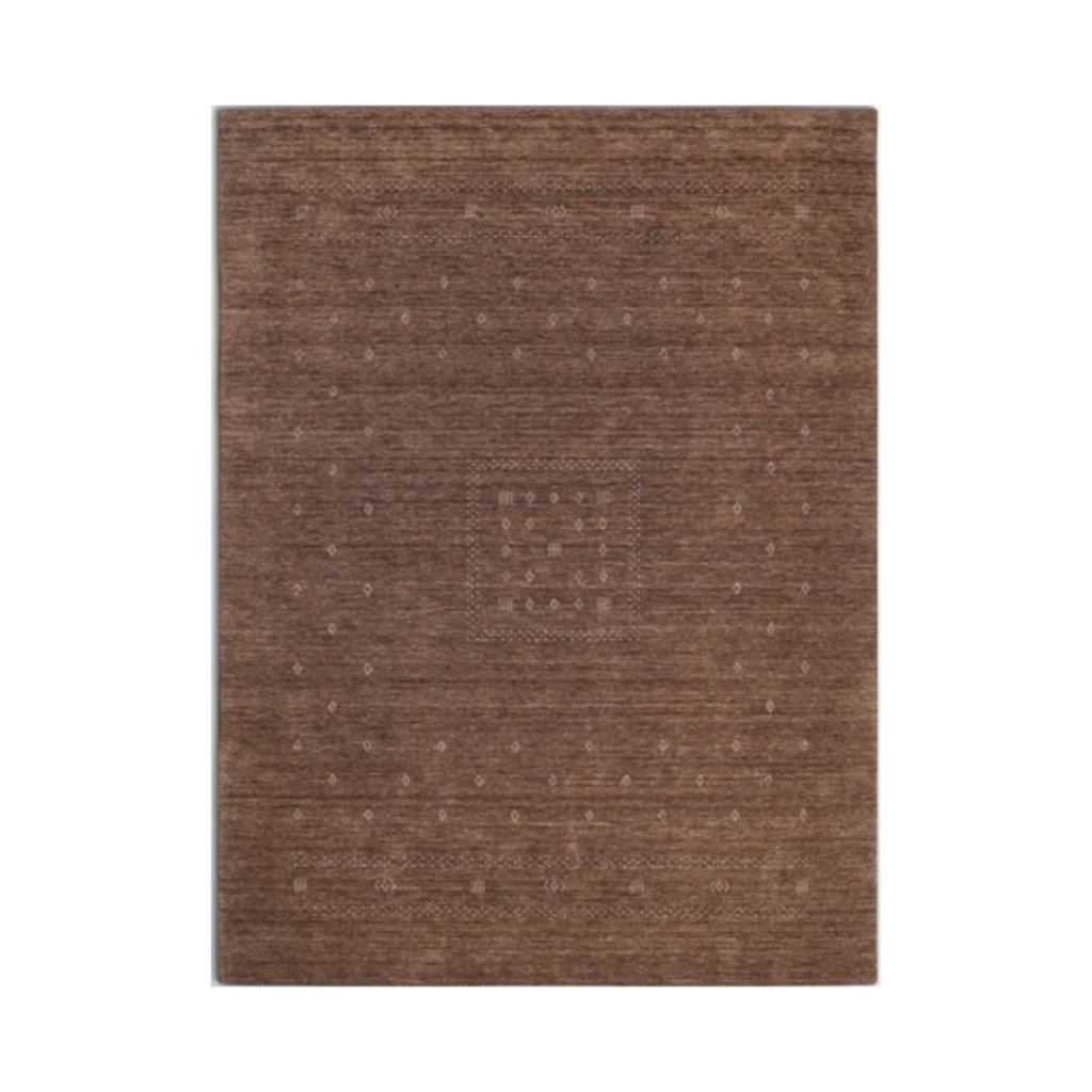
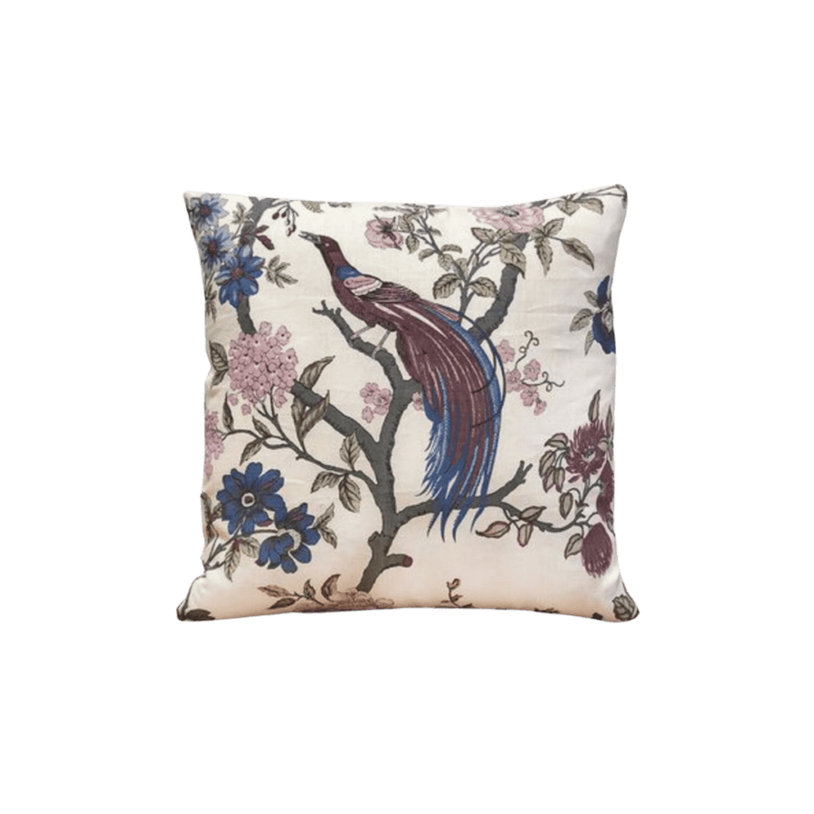
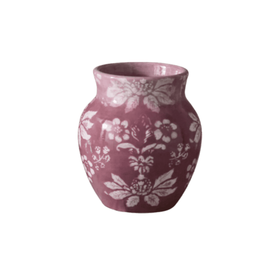
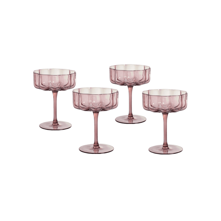
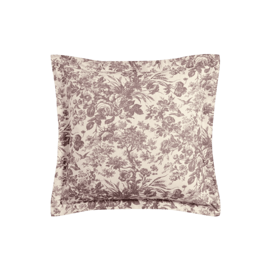
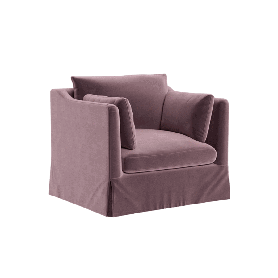
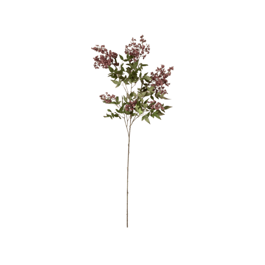
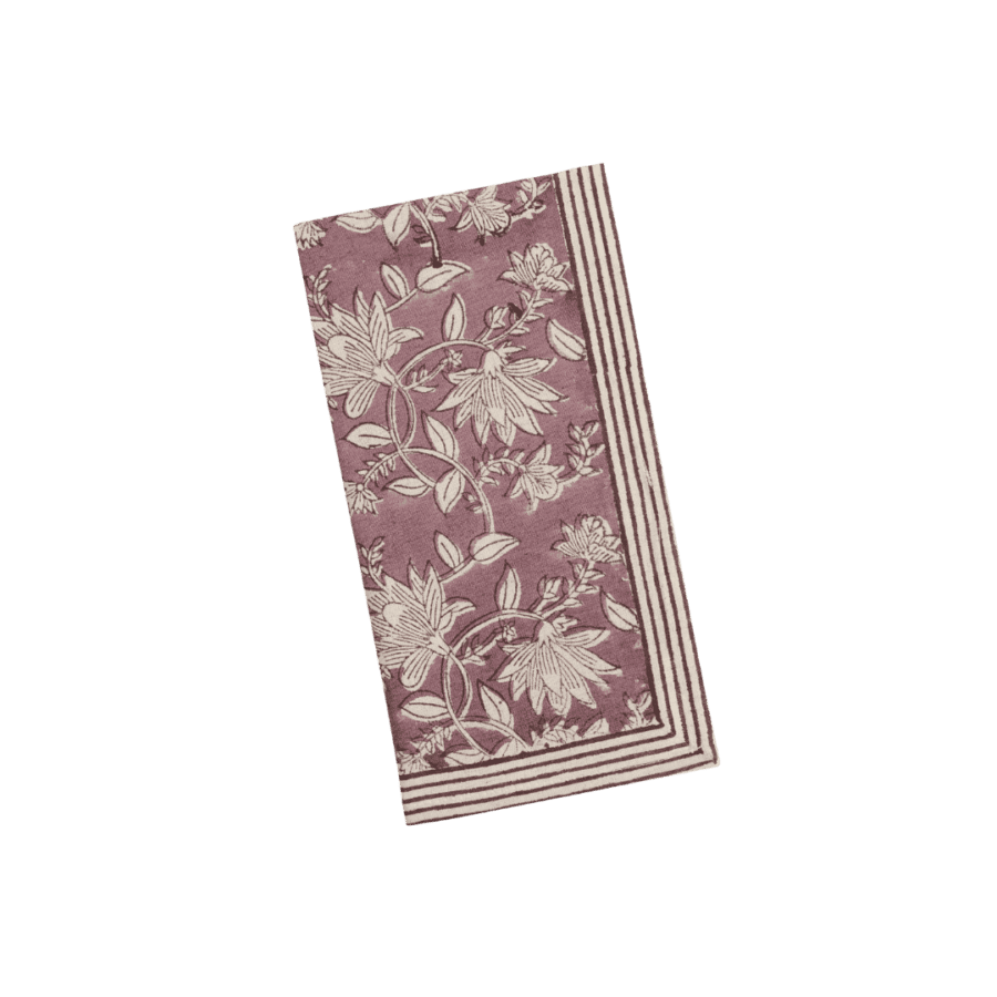
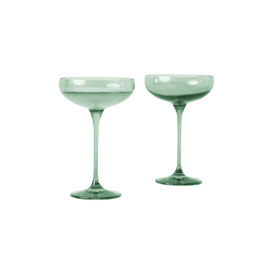
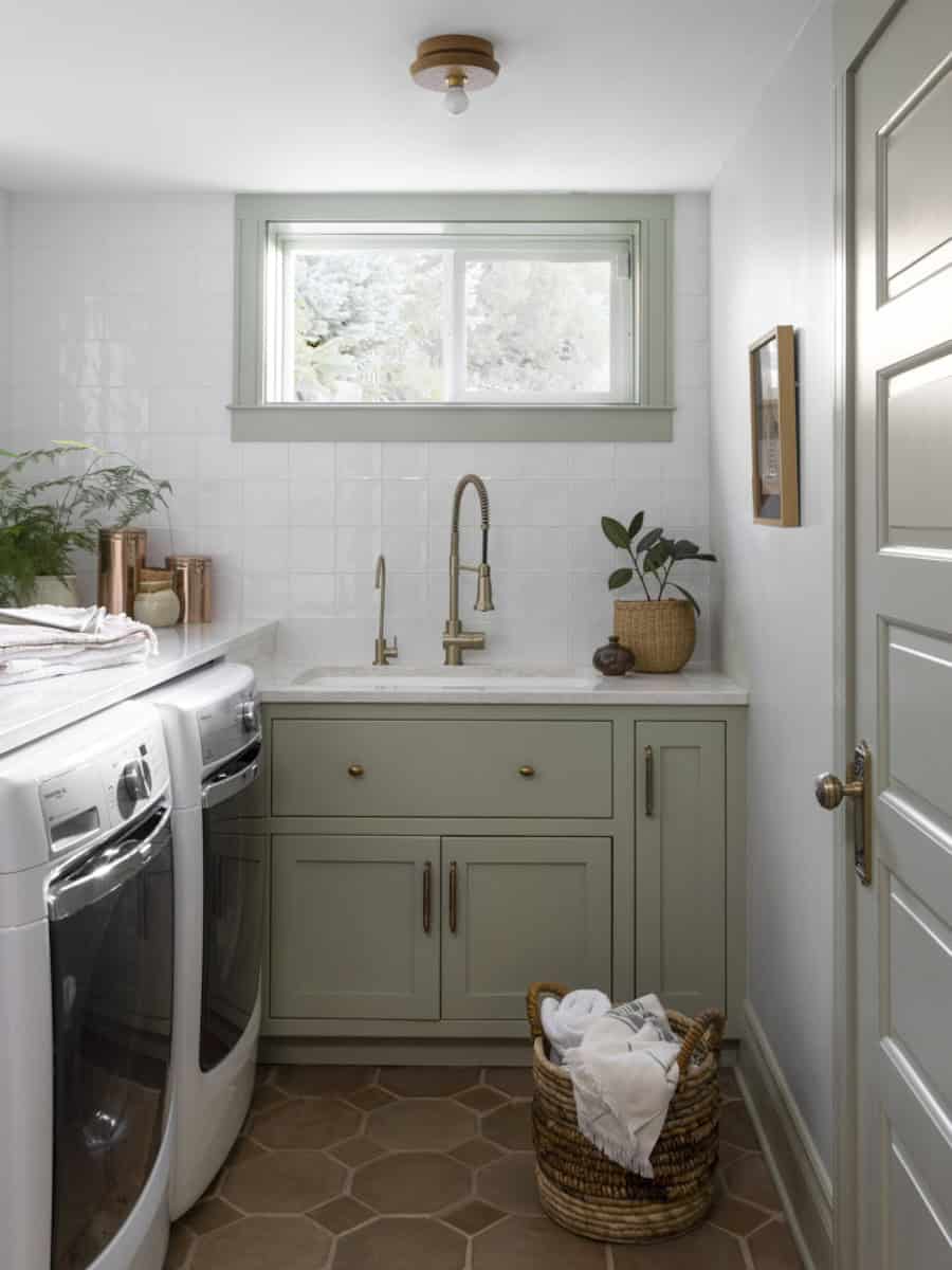
Benjamin Moore’s Cinnamon Slate is an irresistible blend of sophisticated velvety brown and scrumptious heathery plum.
This moody tone is equal parts grounding and luxurious – creating a color that feels both timeless and refreshingly modern. Its subtle violet undertones add depth and warmth which makes it an ideal choice for anyone craving a rich, comforting palette in their home.
As someone who gravitates toward colors with a touch of purple, I’m completely smitten with this versatile and utterly gorgeous shade!
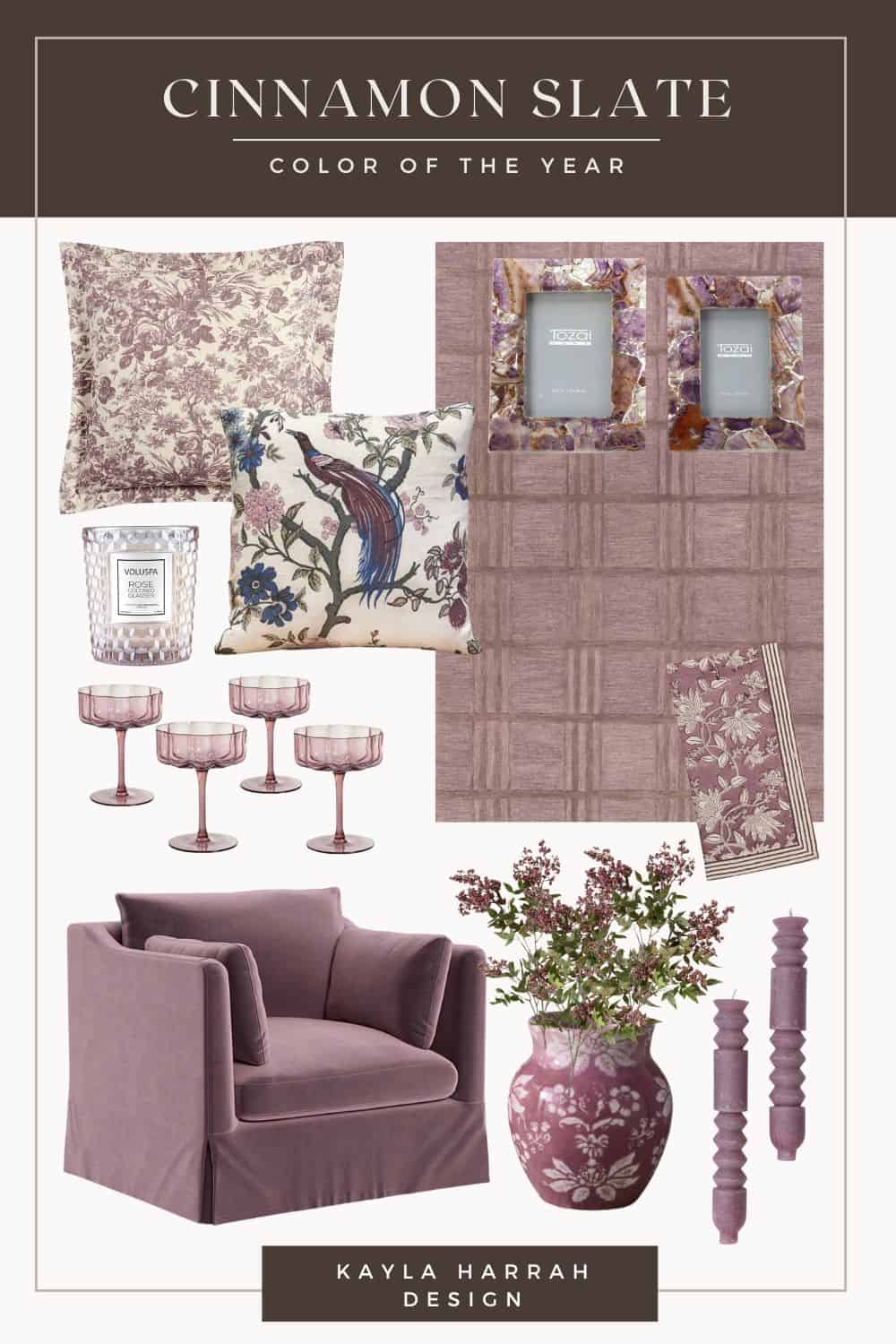
For a cosmopolitan look, Cinnamon Slate pairs beautifully with warm neutrals like creamy whites, taupes, and soft beiges. For a softer approach, consider pairing this hue with muted green patterns to create a welcoming contrast.
This color really shines in intimate spaces like dining rooms, bedrooms, and family rooms. To fully embrace the warmth of Cinnamon Slate, try incorporating it through textiles like throw pillows or rugs, or make a statement with furniture pieces and artwork.

2025 Color Of The Year: HGTV Home By Sherwin Williams
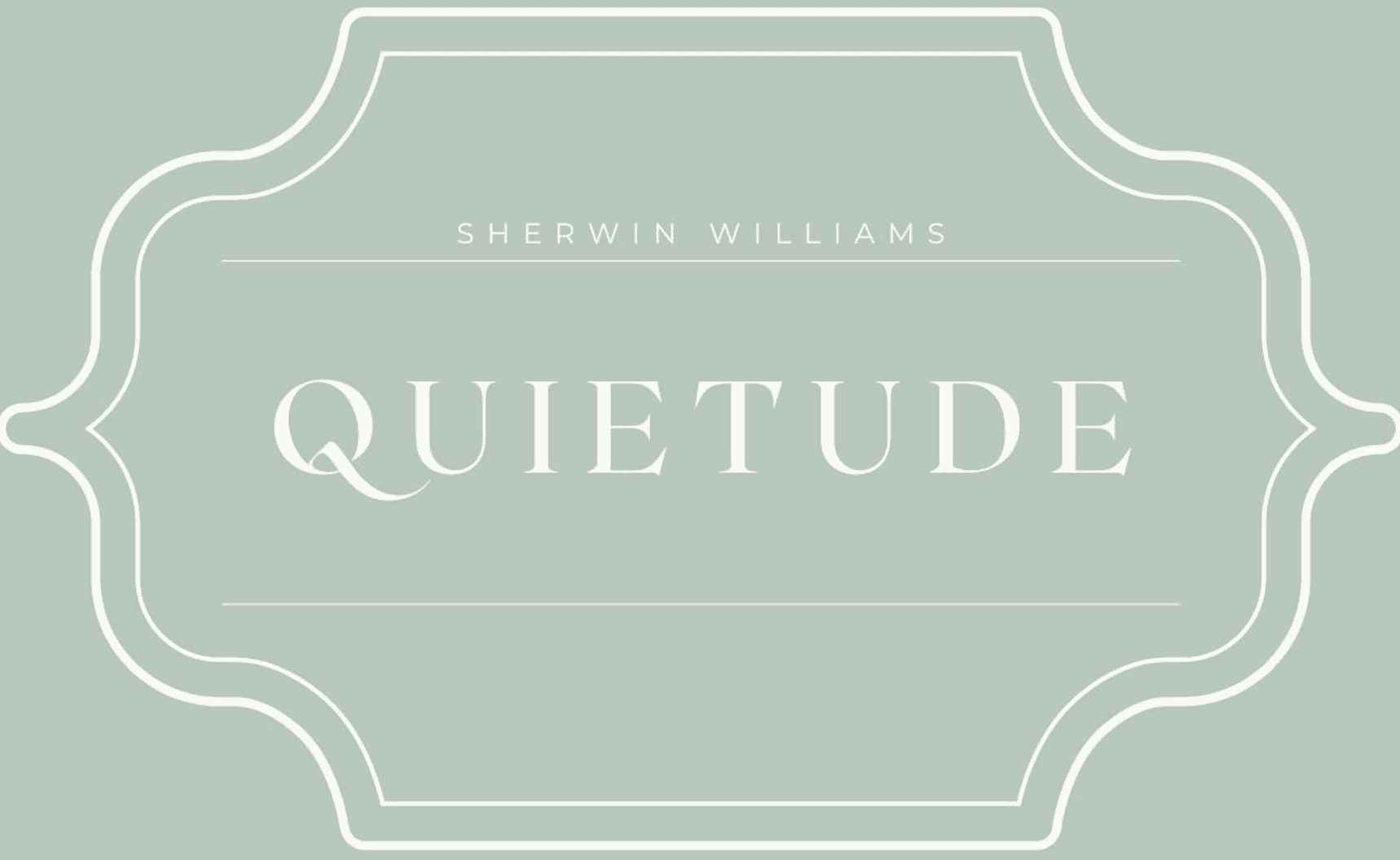
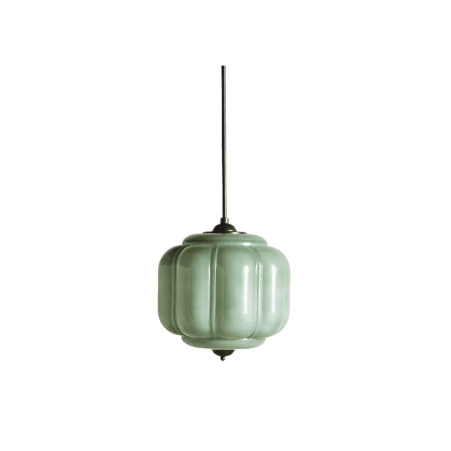
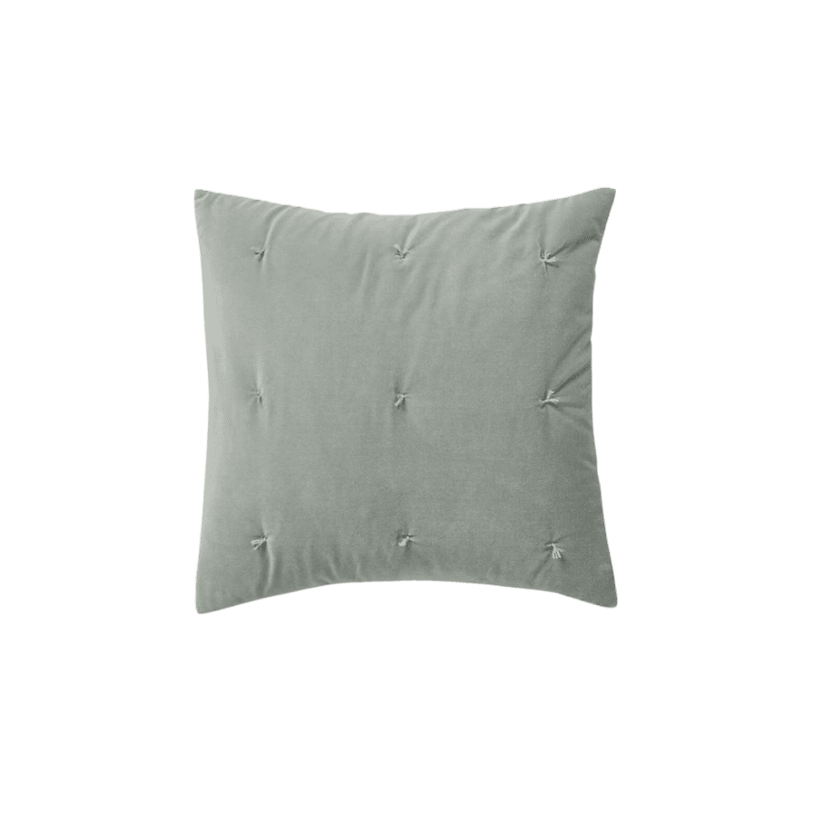
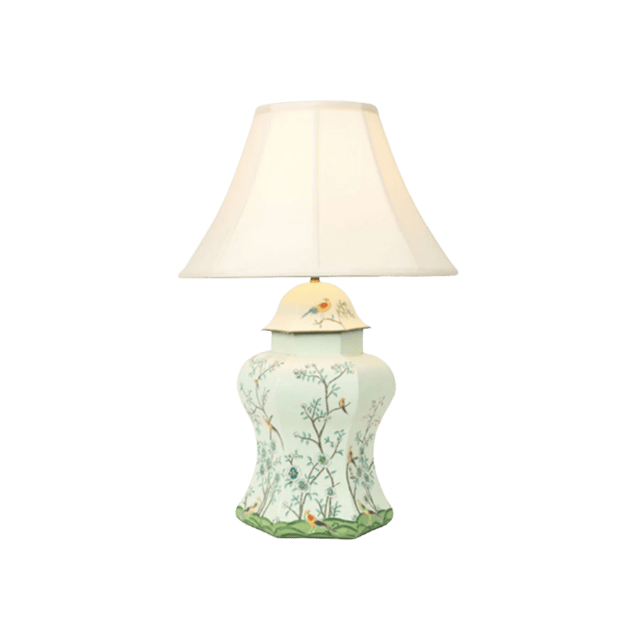
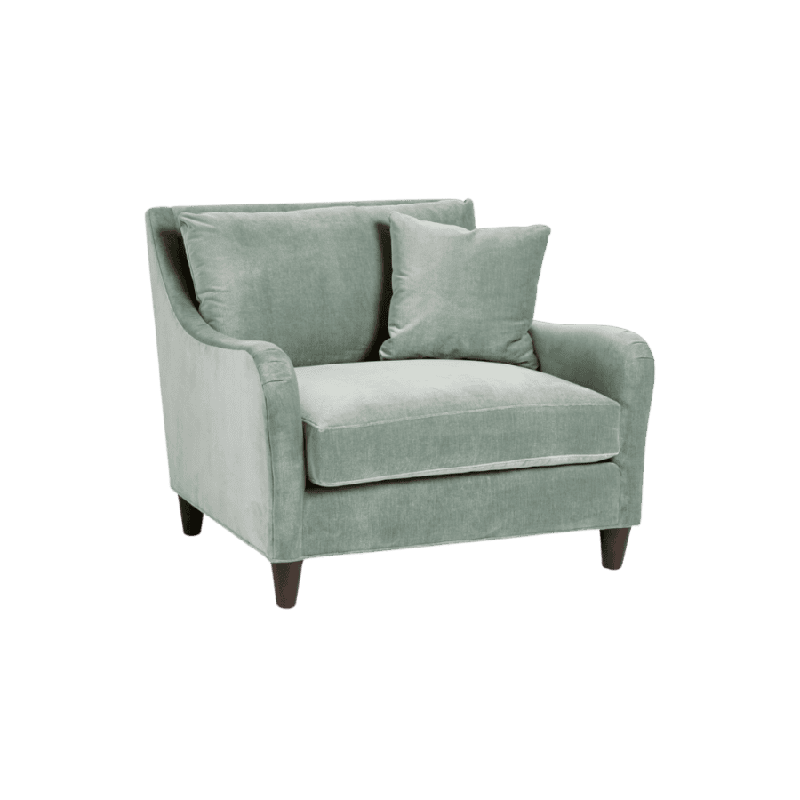
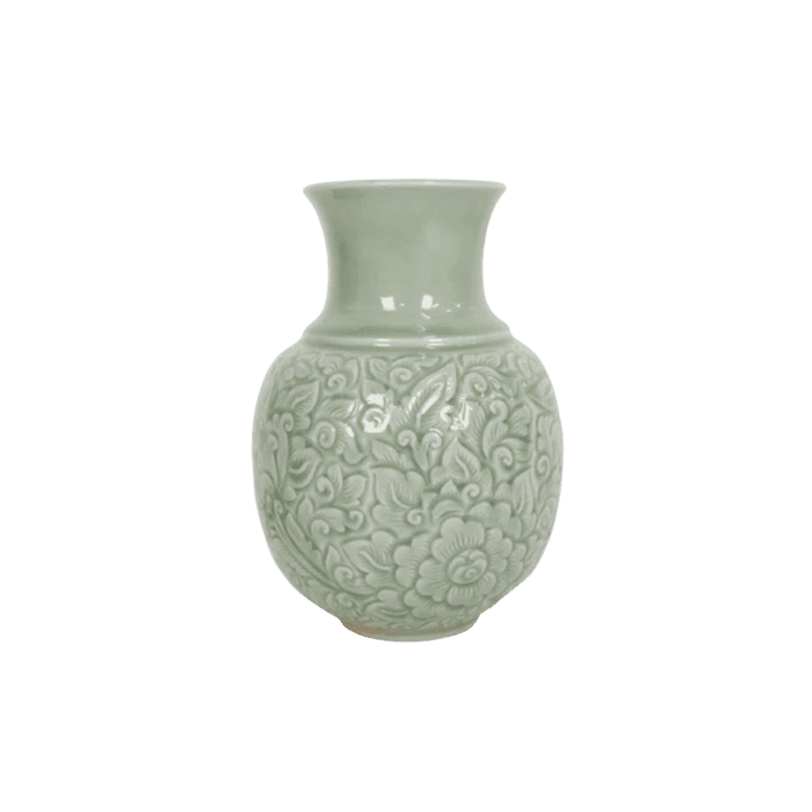
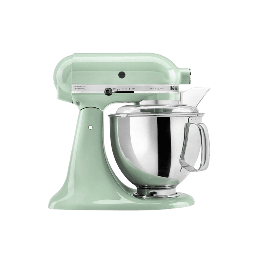
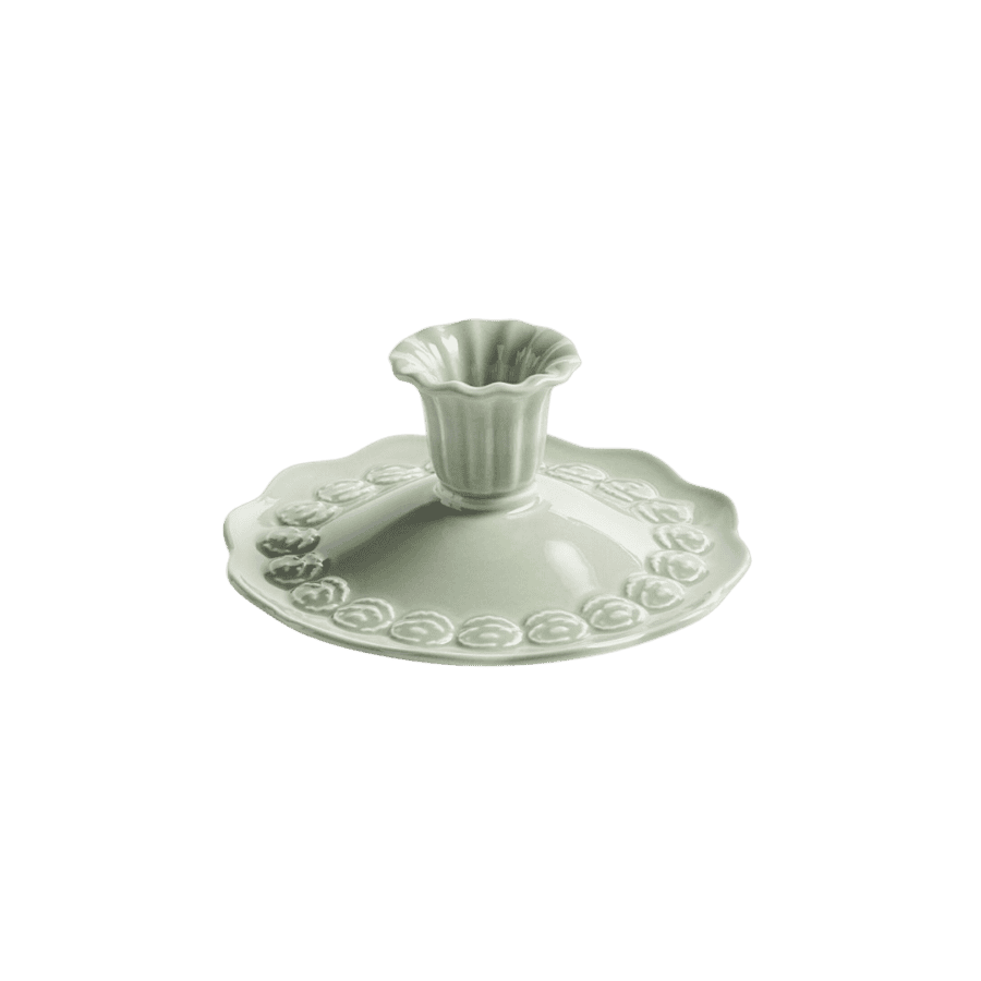
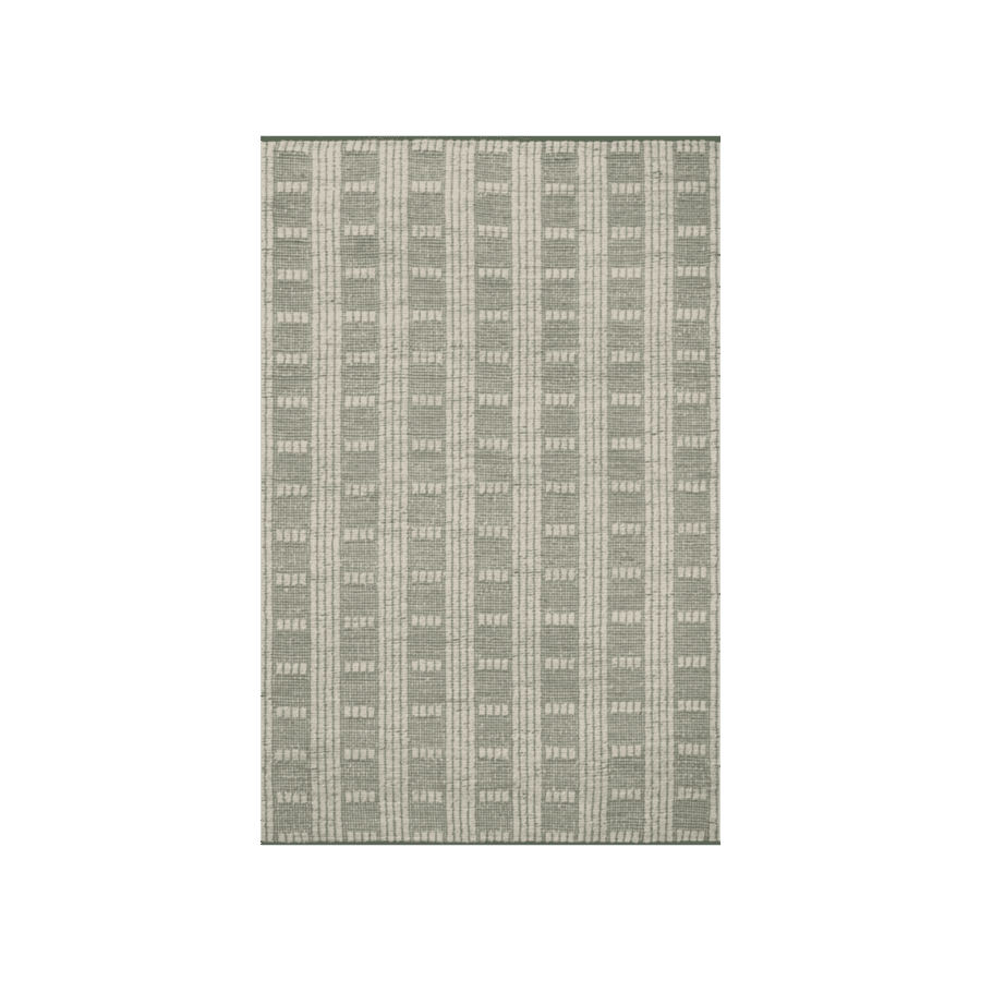
Sherwin Williams Quietude is a soothing, nostalgic shade of soft green-blue that feels like a gentle hug from the past. Unsurprisingly, this calming tint is understated but versatile enough to complement a range of interior tastes.
Whether you lean traditional, coastal, or even cottage-core, this color effortlessly bridges the gap between heritage and today’s design trends. I’m especially drawn to this hue because it feels so nostalgic and reminds me of vintage jadeite glassware.
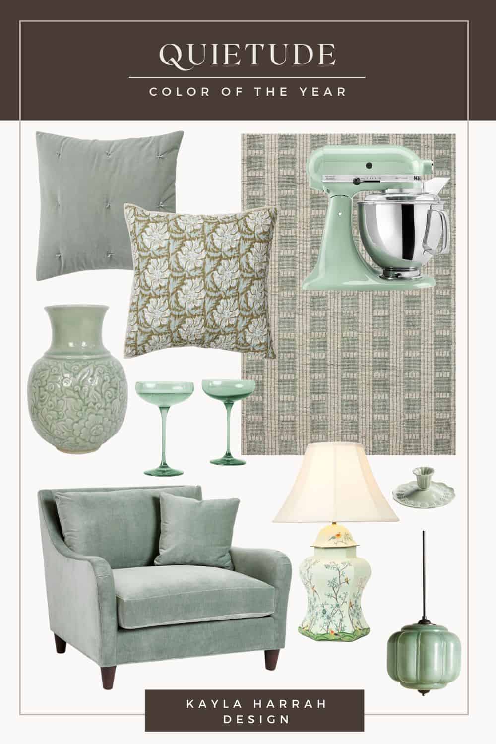
For a fresh yet timeless look, Quietude pairs beautifully with warm whites, natural woods, or muted terracotta accents. If you want to add depth to your interior, consider pairing this hue with darker green tones for a nice contrast. This color is perfect for relaxing spaces like bathrooms and reading nooks and works well to brighten up dark spaces.
Whether you’re refreshing a room or just adding a few thoughtful touches, I hope this post provided helpful and actionable tips for incorporating these trendy hues into your home.
What do you think of these color of the year picks? Are you more drawn to the bold, moody tones or soft, calming hues? Let me know how you plan to bring these stunning colors into your home – I’d love to hear your ideas!
You might also like:
KHD Approved 2025 Interior Design Trends


+ Show / Hide Comments
Share to: