


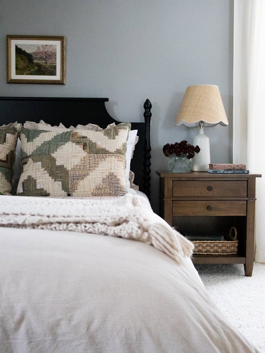
Kayla Harrah Design x Annabode
With the promise of sunshine just around the corner, it’s hard not to crave a little refresh at home. Personally, I love the energy that comes from mixing patterns and layering color throughout my spaces each season. But, I know that’s not everyone’s comfort zone. In fact, a lot of my conversations with clients start with “I like to transition my home from season to season, so keeping a neutral home works better for me”.
Trust me, I get it. Neutrals are safe, versatile, and undeniably timeless. But here’s the secret: color can act as a neutral, too. In fact, the right shades can transition effortlessly from season to season – often even better than traditional neutrals.
So, if you’ve been curious about adding a little something extra to your neutral home but aren’t quite sure where to start, this post is for you. Each of the photos in this post are beautiful examples of how a neutral base benefits from even the tiniest pops of color. If you’re ready to bring some magic into your home, keep reading for my tried-and-true approach to incorporating color in a way that feels approachable, intentional, and uniquely you.
Why Is Everyone So Obsessed With Having A Neutral Home, Anyway?
It’s a fair question, isn’t it? Everywhere you look – Instagram, Pinterest, and even your favorite home décor stores, it feels like neutral tones are the reigning champions of interior design. And it’s easy to see why: neutral colors are often labeled as safe.
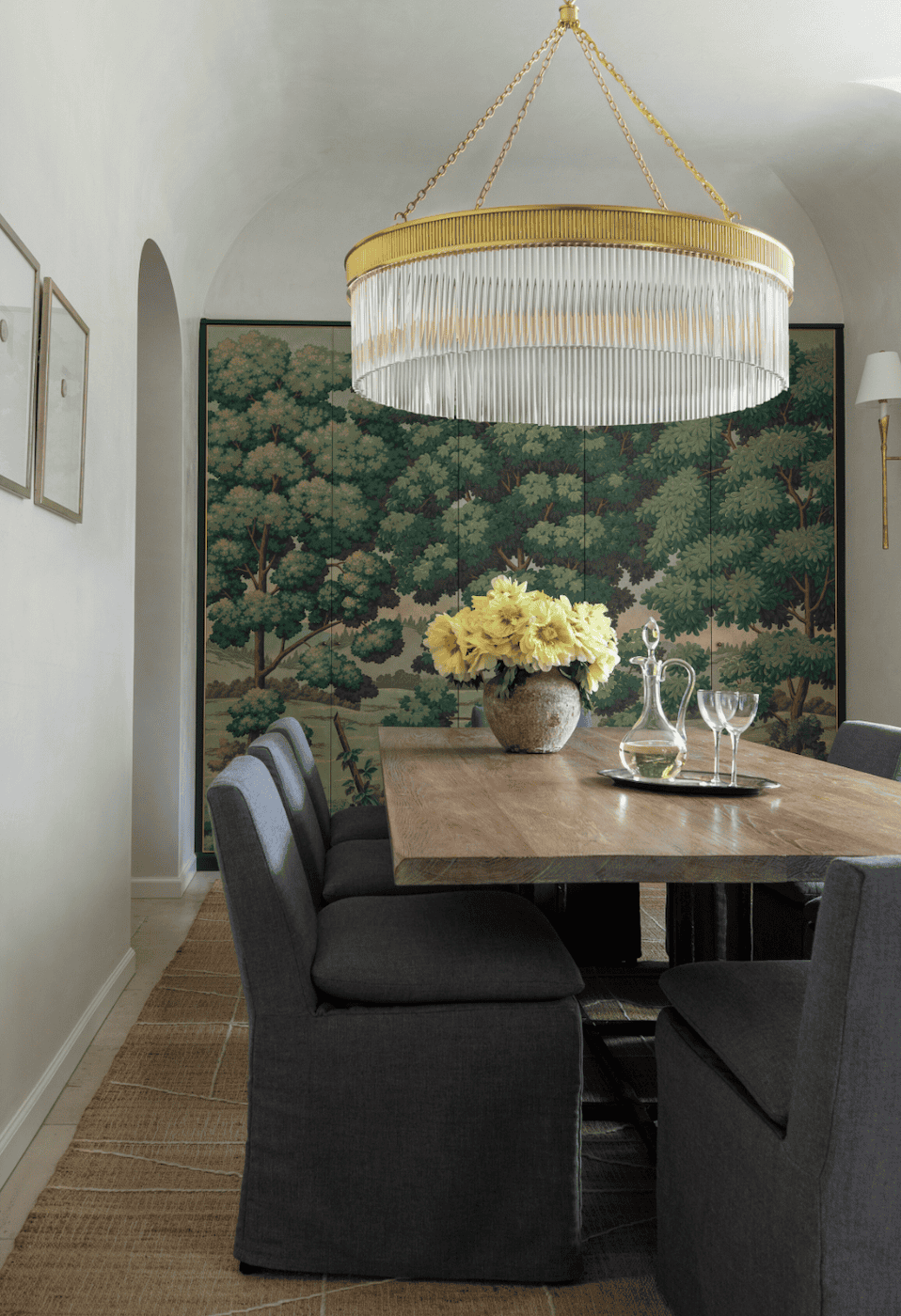
Image Source: Marie Flanigan Interiors
When you’re constantly exposed to homes awash in white and black, it’s no wonder you might feel drawn to them. Neutral spaces are everywhere and that consistency can make them feel like the right choice. Add to that the promise of a clean, polished, and put-together aesthetic and it’s no surprise so many people gravitate toward them.
But here’s what I think: while neutrals do provide a beautiful blank canvas, color can have an even bigger impact on an interior. A neutral palette sets a strong foundation, but it can also feel like it’s holding back a bit. That’s where color comes in. Even just a few thoughtful pops of color can infuse personality, warmth, and life into a space in ways neutrals never could on their own.
How Online Trends Influence Your Neutral Home
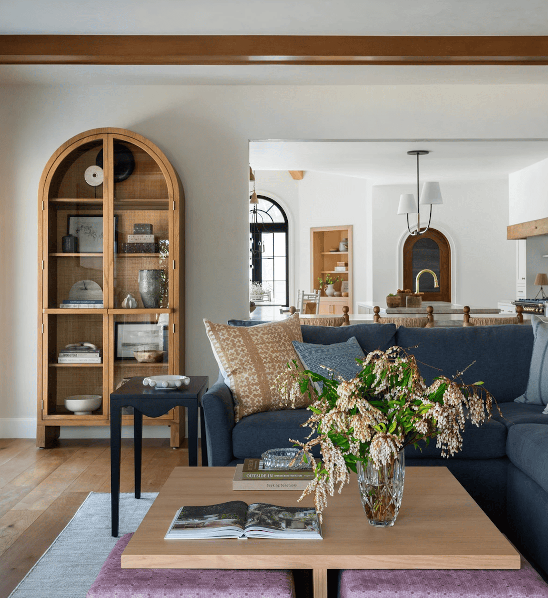
Image Source: Lindsey Brooke Design
Just to clarify, I’m not writing this post to knock neutral homes – there are so many that I think are absolutely beautiful. And if you love them, then you should absolutely embrace them!
However, if you’ve found yourself gravitating toward neutrals simply because they seem like the safe choice, you’re certainly not alone. After all, social media is full of influencers and design accounts showcasing perfectly curated, all-white homes. And let’s be honest, those spaces photograph beautifully, but that doesn’t mean they’re the practical option for every lifestyle. It’s easy to be influenced by what’s trending – especially when it’s plastered across every social feed and blog.
But here’s a question worth considering: who are you taking your design cues from?
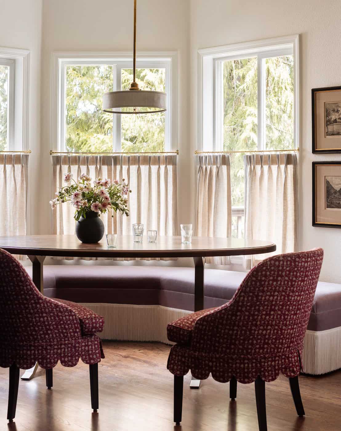
Image Source: Heidi Callier Design
While influencers often showcase beautifully styled spaces, their designs are frequently influenced by the latest trends. And oftentimes, that trend is a neutral and minimalist palette. So, the question becomes do you want your home to reflect your personal style and remain timeless? Or are you looking to create a space that blends in with the thousands of other whitewashed interiors you see every day?
In the end, your home should tell your story. It should reflect your personality, your lifestyle, and what makes you feel comfortable and inspired – not just what’s popular at the moment. Sure, that all-neutral, influencer-approved home might look great on a screen, but is it really you? And more importantly, will it still make you feel happy five years down the line?
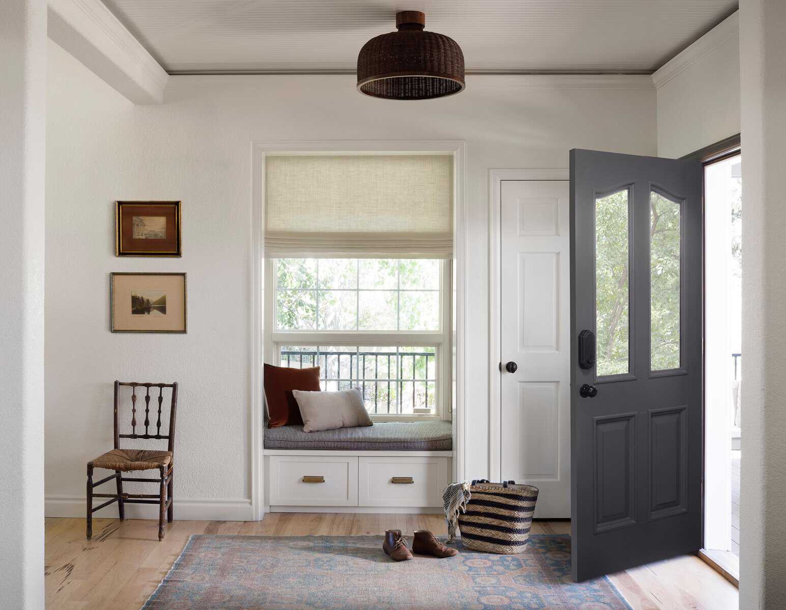
How To Choose Colors That Work With Your Neutrals
Kayla Harrah Design x Annabode
Adding color to your interiors is all about intention and balance. The key here is finding hues that complement your existing neutral tones rather than competing with them.
One of the easiest ways to do this is by identifying a “bridge color”. For example, if your space leans into warm neutrals like beige or taupe, than earthy tones like rust, olive green, or soft terracotta can feel like a natural extension. If you favor cooler grays or whites – than shades of dusty blue, sage, or even muted lavender can feel just as timeless.
Why Color Is the True Key to Timeless Design
If there’s one thing I’ve learned over the last decade as a designer, it’s that nothing dates a home faster than sticking to a single design trend. Neutral spaces might feel safe now, but in five or ten years they’ll look like relics of this era. Remember when every home was Tuscan-inspired in the early 2000s? Or when farmhouse décor was the trend of the 2010s? Homes that rely too heavily on trends (even neutral ones) risk feeling outdated as soon as the next big thing comes along.

Image Source: West of Main Design
On the other hand, color has a way of transcending time. Think of historical homes you’ve visited or iconic interiors you’ve admired. They likely weren’t beige from floor to ceiling. Instead, they embraced color like deep jewel tones, soft pastels, and earthy hues. Further proof that a thoughtfully chosen color palette adds timelessness, character, and individuality to a space.
The beauty of color also lies in it’s versatility. It can evolve with your style and adapt to different trends without ever feeling stale. Furthermore, a home layered with color intensifies story telling and enhances the emotions your home evokes in every season.
Where To Start: Colorful Touches That Won’t Overwhelm Your Home
For many people, the hardest part about adding color is knowing where to start. The good news is you don’t have to overhaul your entire home in one go. Here are some simple ways to bring color into your neutral home without feeling like you’ve gone too far:
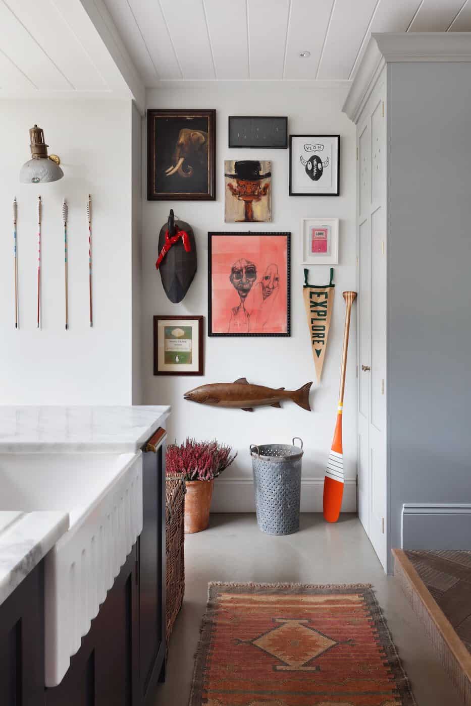
Image Source: Ham Interiors
Art and Décor // Artwork is one of the easiest ways to experiment with color. Choose pieces that incorporate hues you love and pair them with neutral frames for a cohesive look.
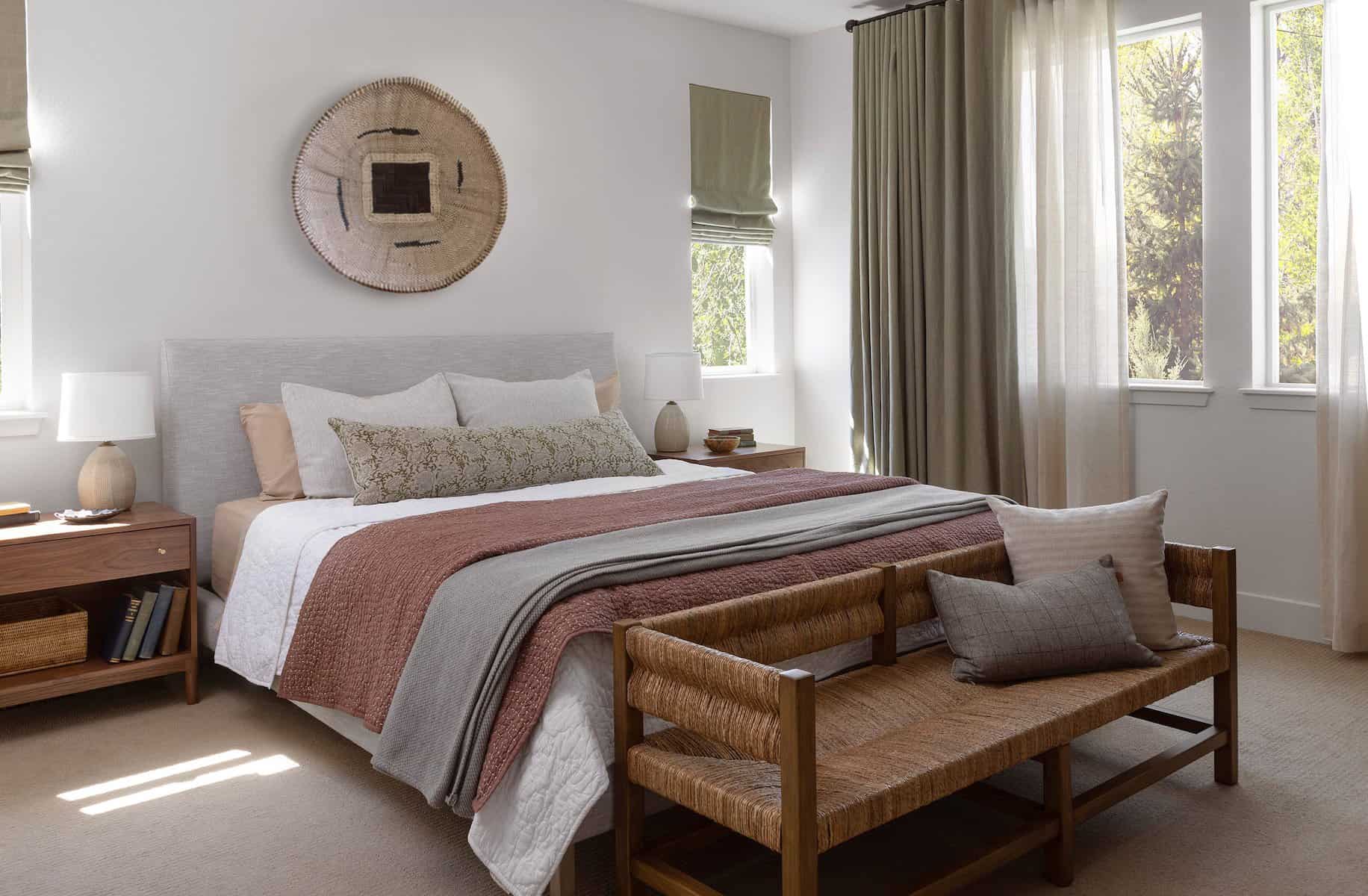
Textiles // Pillows, throws, and rugs are low-commitment ways to test out a color palette. Plus, they’re easy to swap out as the seasons change.
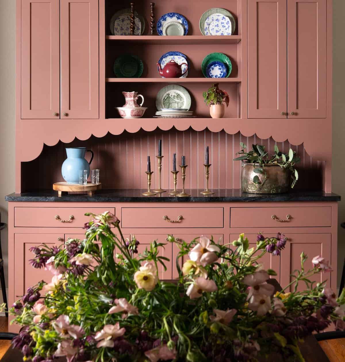
Painted Furniture // A dresser, console table, or even your kitchen cabinets can become a colorful focal point. Choose a shade that complements your existing neutrals and watch your space come to life.
Natural Elements // Don’t underestimate the power of plants and flowers! Greenery adds vibrancy to a room while fresh blooms introduce pops of seasonal color.
Color Drenching // If you’re feeling really brave, try color drenching your walls, millwork, and ceiling all in the same paint hue.
Final Thoughts From An Interior Designer Who Loves Color
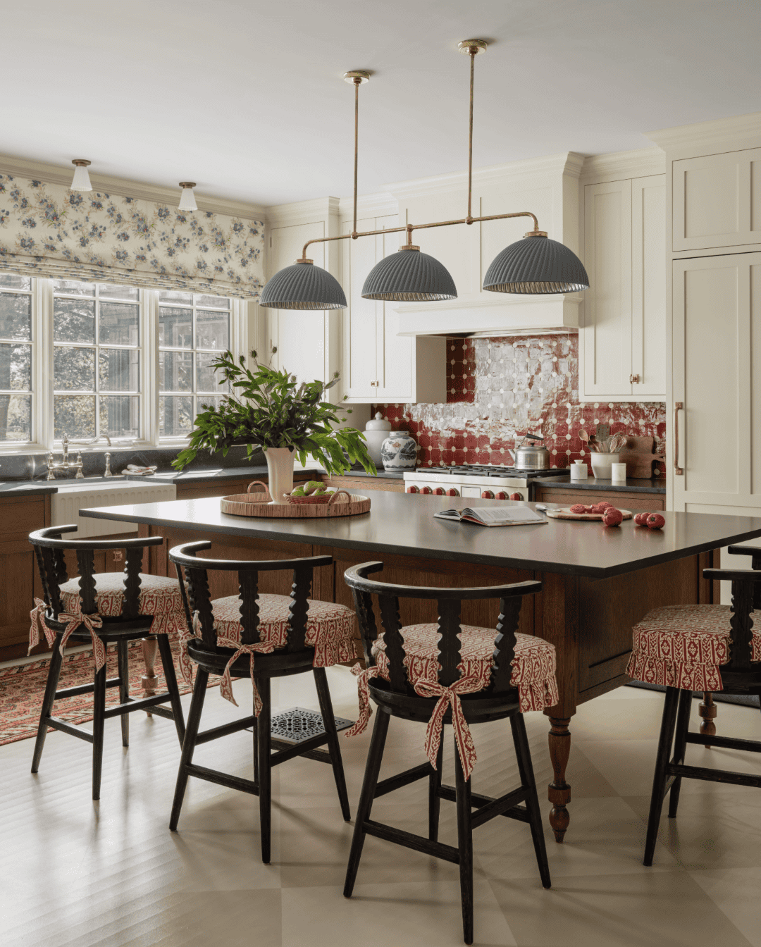
Image Source: Katie Rosenfeld & Co
There’s nothing wrong with neutral home spaces. But, when you allow just a touch of color to creep in, something magical happens. Time and time again I’ve seen clients go from hesitant to thrilled when they let go of their fear of color and allow me to show them how it can transform their space.
I’d love to hear your thoughts on this post in the comments below. Do you prefer a neutral home or a colorful one? If you’re ready to embrace color in your home but aren’t sure where to start, I’d love to help! Schedule a one-on-one design consultation with me to get started.


+ Show / Hide Comments
Share to: